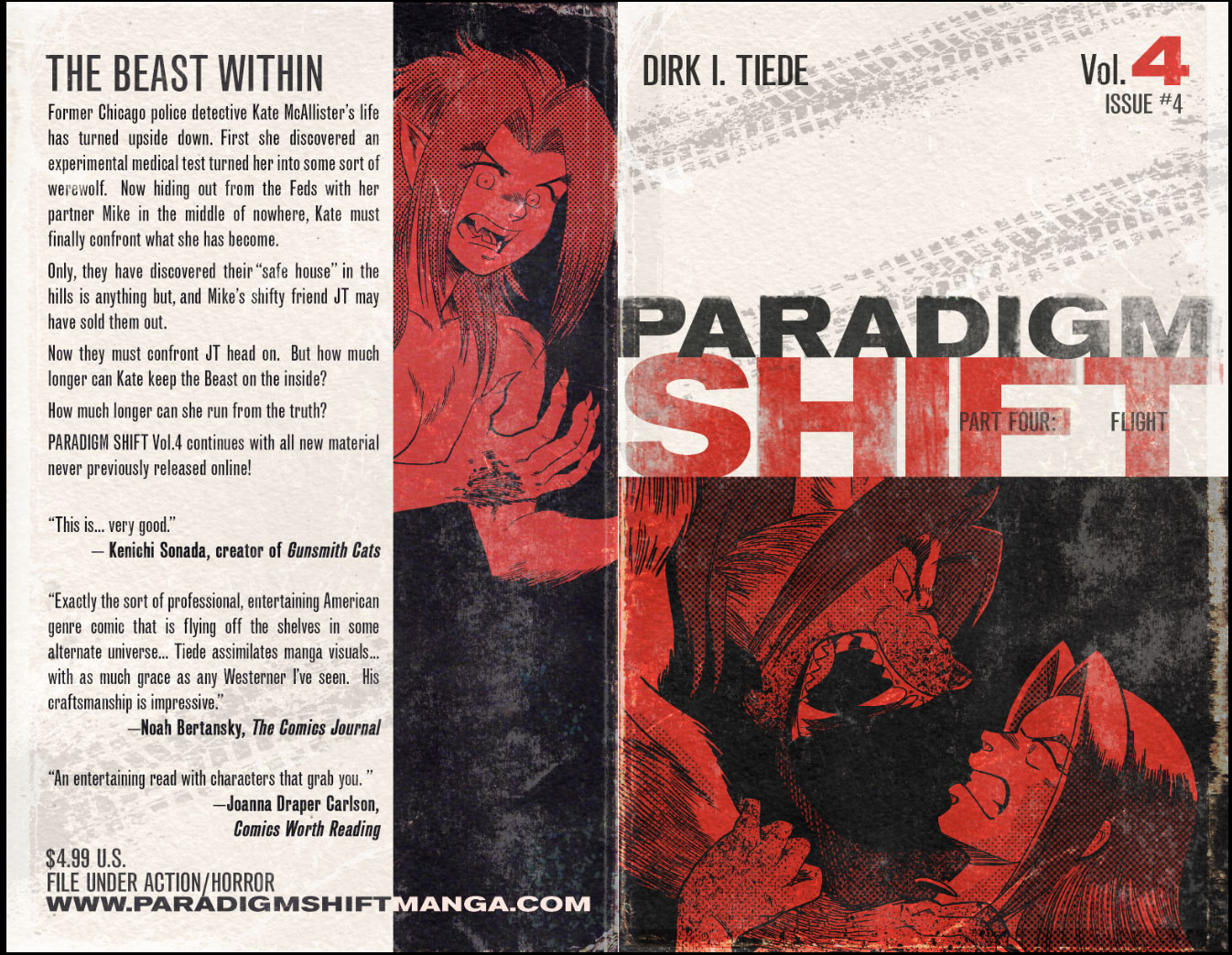
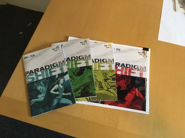
Being the fourth installment of my How to Draw Comics series.
 Now that you know who your character is, it’s time to draw her. Seeing how you’re going to be drawing this character a lot over the course of your comic, it’s a good nail down their look so you can be consistent. However, it’s not uncommon for a character design to evolve over time in a comic—it certainly did to the characters in Paradigm Shift—but spending the time to work out the character’s overall shape, costume and before starting Page 01 is worth the effort. Additionally, working on understanding human anatomy and figure drawing practice can really take your character drawing to a new level.
Getting Into Character
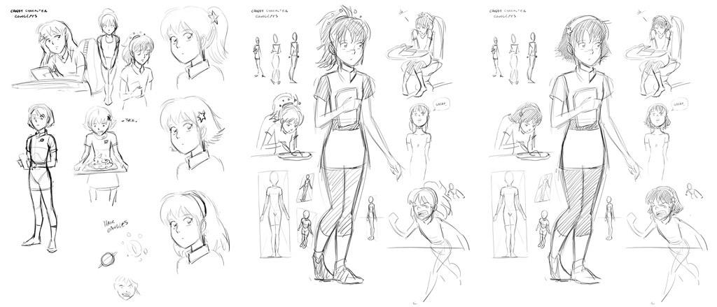
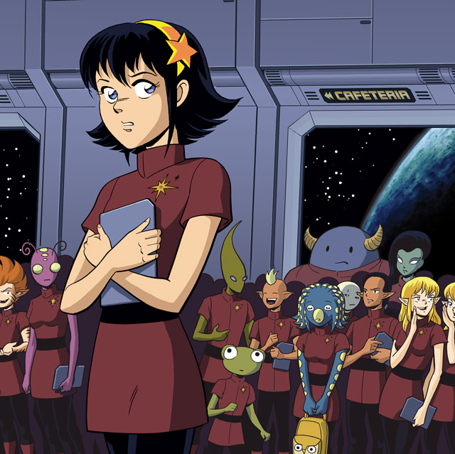
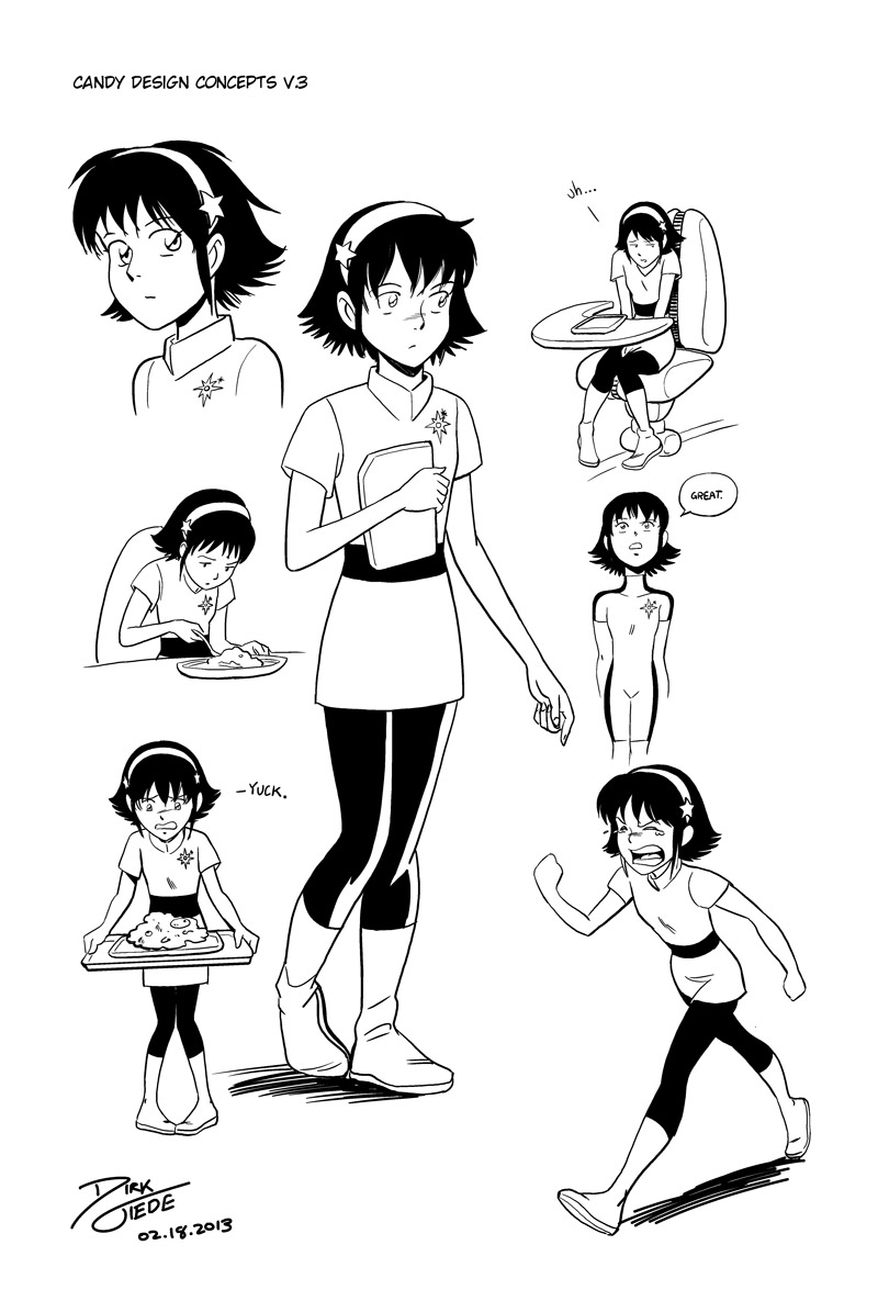
Here’s some examples of playing around with a character before starting a project. This is Candy from STRANGER. I knew I wanted her to look a bit like a Miyazaki character, but I played around with a couple of designs before settling on her final look:
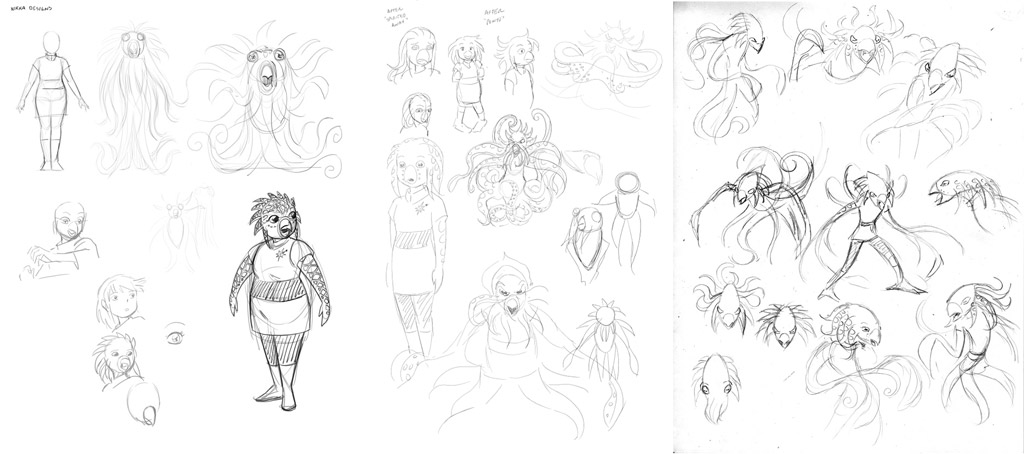
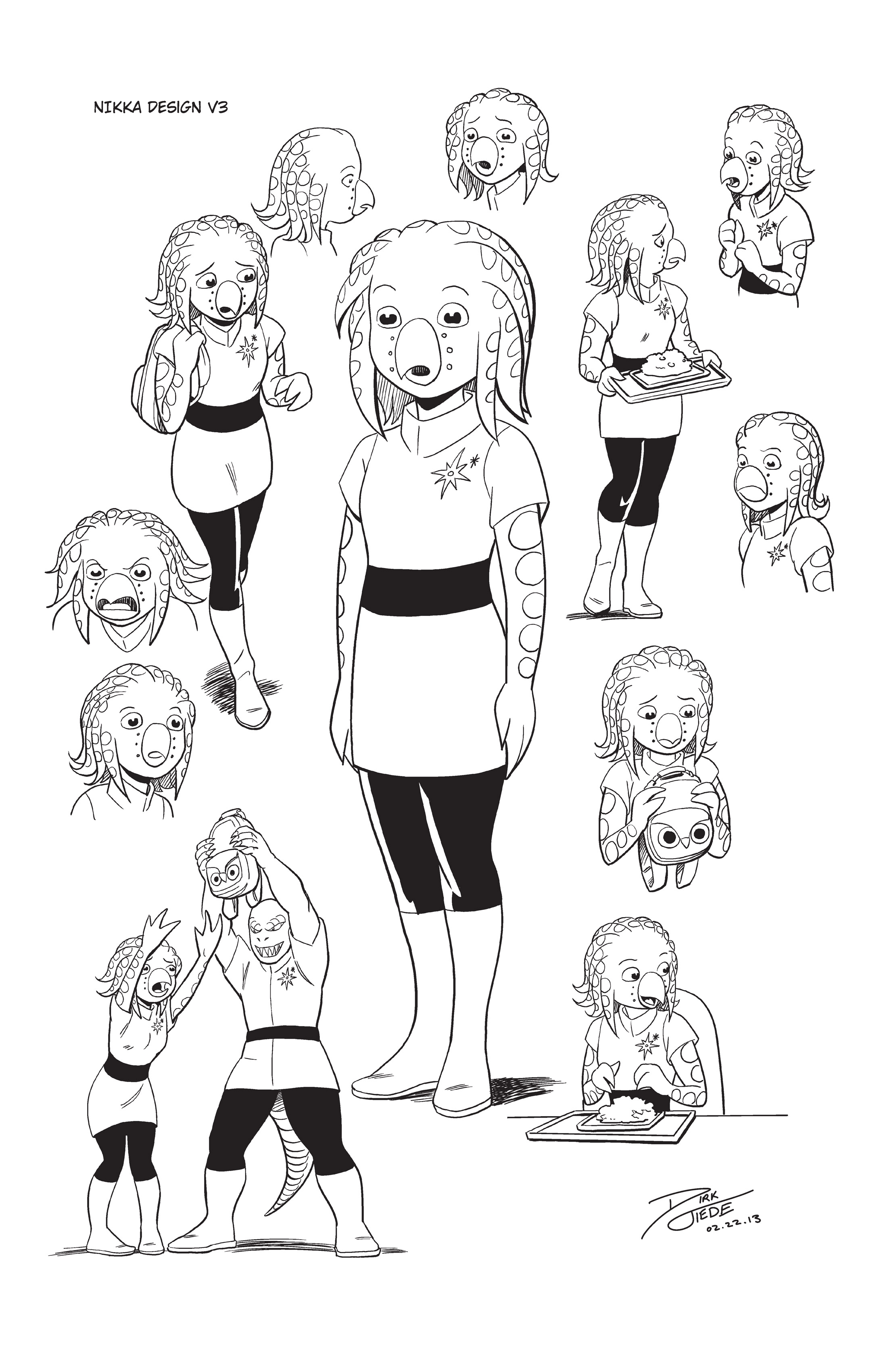
For Candy’s counterpart, Nikka, it took a little more work before I nailed down her design. Again, I took some inspiration from Miyazaki by riffing off of Sen from “Spirited Away”. However, by borrowing the rounder head and wide-spaced eyes and combining them with features inspired by a cuttlefish, I was able to create something entirely new.
Here’s her final design:
A Quick Note on Silhouette
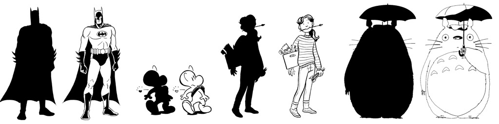
The first thing anyone will see about your character is the shape his or her outline creates, not the details within. Having characters with distinct body and head shapes will help make them more recognizable in your story.
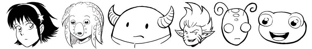
The Head & Face
Firstly, let’s look at the head and face because the are probably the most important features for identifying your character and letting him express himself. Even the shape of the head can suggest a personality—triangular, round, square. Each gives a different feel. Also, adding differently shaped hair or other features that can create a unique, recognizable shape can help tremendously as well. This is how I designed the alien characters for the story STRANGER:
In order to draw my characters’ heads from any angle, I use two basic head shapes as a starting point and then squash and stretch them into the approximate shape. I borrow from techniques used in animation to construct a character from more basic shapes underlying the head. The first is the classic anime “seed” shaped head:
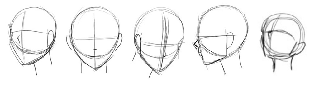
I draw the seed by starting with a circle (or spherical ball, as I imagine it in my mind) and then hanging a pointed jawline off that circle a various angles. Then by drawing a “cross” dividing the center of the face and where the eyes will be, you can use this seed shape to draw that head from any angle. This is the shape I use for Kate’s head in Paradigm Shift. Using this as my starting point, I rough the entire head, then add in more detail before completing the final drawing. I use this process for all my comics and illustration, working from rough forms through final image. This is how I use the seed shape to draw Kate from the front, side and 3/4 view:
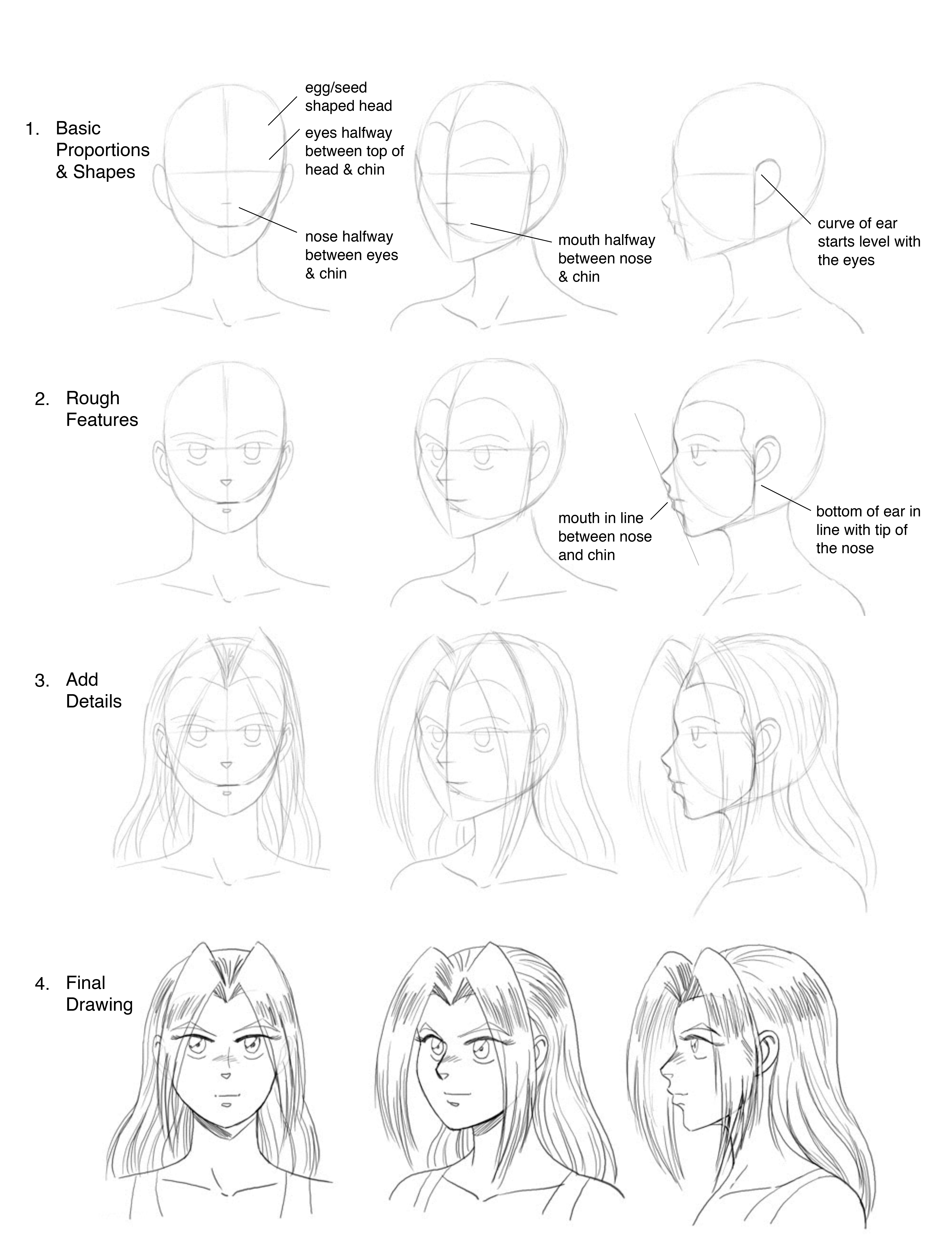
Take note of how the proportions of the face translate across between the differing angles. The line that runs through the eyes is roughly halfway between the top of the head and the chin. The tip of the nose sits about halfway between the eye line and the chin. The mouth sits about halfway between the nose and the chin. From the side, if you draw a line from the tip of the nose to the chin, the lips will roughy fall in line within there. The ears sit on a line that is halfway between the front of the head and the back and their curve starts in line with eyes. If you imagine the center line of the face curving to the left or right and the eye line curving up or down, you can start to see the head turn in your mind’s eye and use this to draw the head and face from any angle like so:
The second basic head shape I use is based more closely on a more classical human head shape used in American superhero comics:
This is the shape I use for Mike’s head in Paradigm Shift. I start the head with more of an egg shape. Then, I determine which direction the head is facing by drawing a “cross”, just like in the seed example above. I hang the jaw down from the egg shape Unlike the anime “seed”, the jaw line changes more radically between a straight on view and the profile. It’s more a wedge shape and will take more practice to draw from every angle. You can imagine it being a bit like a cube, only tapering downward to create the chin. Also the cranium isn’t completely round like a sphere or egg, but rather is flattened somewhat on the sides. I denote this with lines along the sides of the forehead that wrap around the top of the head
Here’s how I use this to draw Mike from the front, side and 3/4 view:
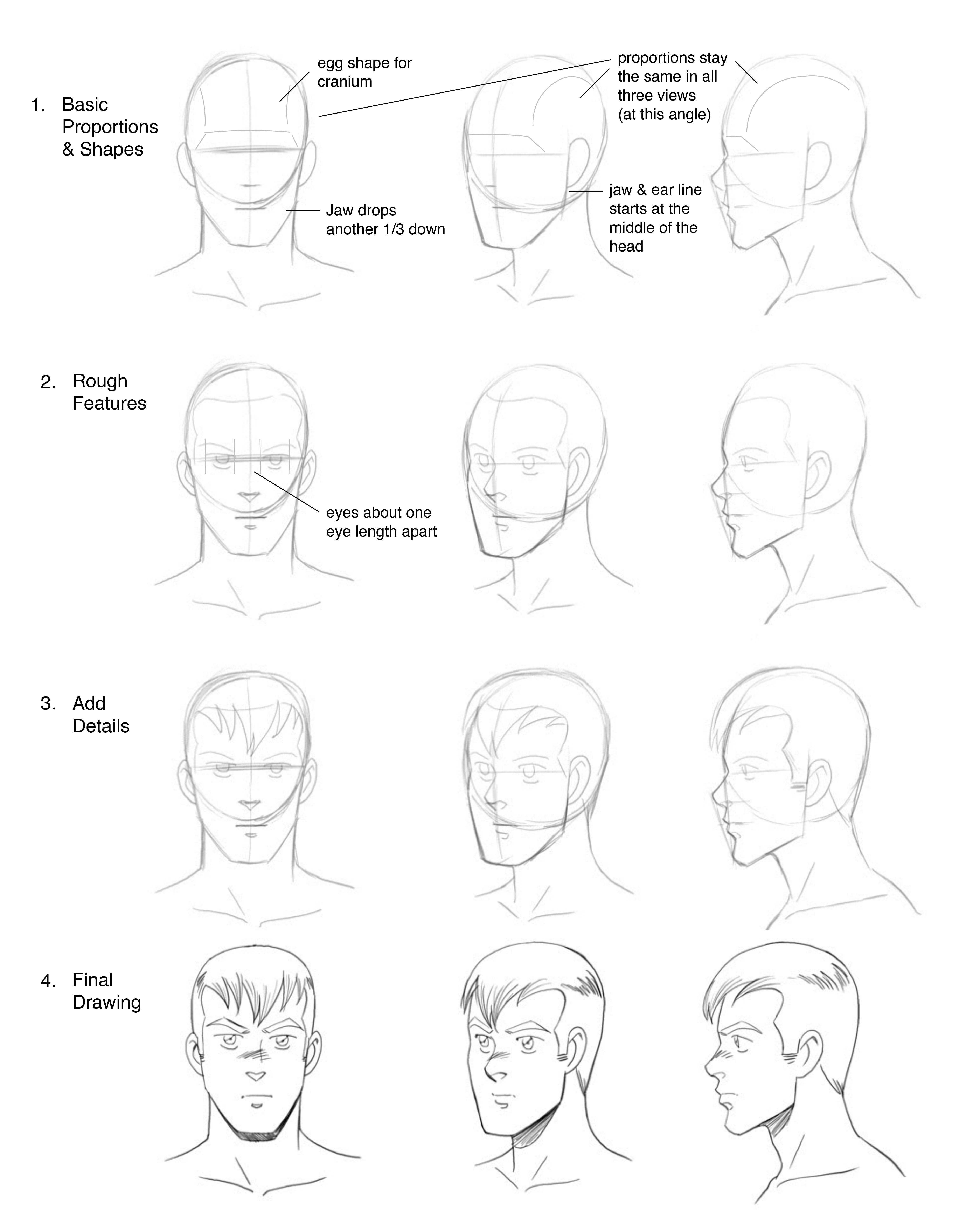
Like in the seed example, there are certain proportions to pay attention to, though they differ somewhat. In this style of head, the eyes lay about halfway down the egg shape. Then the jaw extends down a distance equal to about half the egg shape—thus dividing the face into thirds: top of the head to eyes, eyes to bottom of egg shape, bottom of egg shape to chin. The eyes are smaller on the face than in the previous example and there should be roughly one eye distance between them.
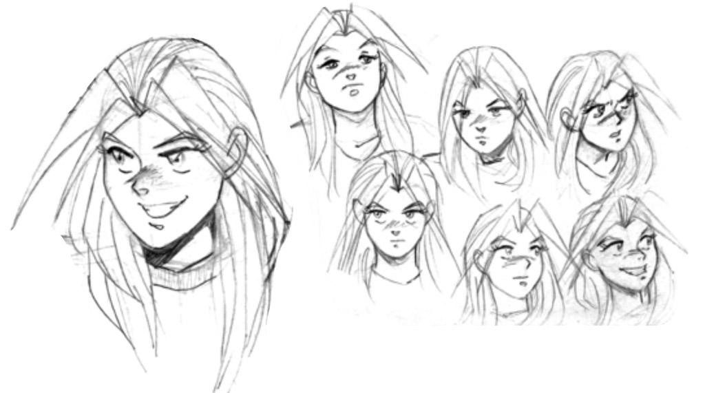
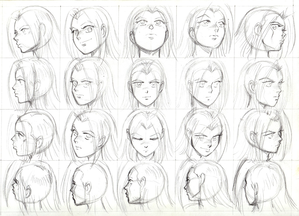
To work on details like hair and drawing heads from many different angles I recommend practicing drawing from life, copying photos and doing the occasional master study of an artist who you greatly admire. The more you practice, the more you will expand your visual vocabulary as an artist and you can combine, mix and match and create brand new features that are purely your own. The same goes for expressions. Play around in your sketchbook and find the faces you feel express your character’s emotions the most vividly.
Drawing the Figure
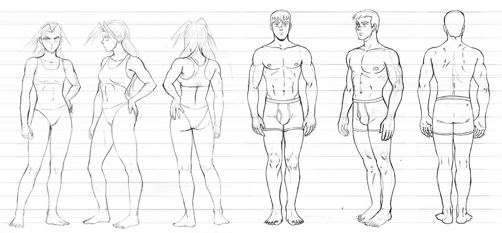
The first step in drawing full-body human characters is to nail down basic proportions. Of course, cartoon characters can be drawn with many different proportions, so I am going to focus on a relatively realistic human proportions first. This method can be modified to stretch characters to be taller or shorter as needed later. Above we have Kate and Mike as examples of “ideal” human female and male proportions. Often in figure drawing, proportions are measured in “heads” because it is an easy way to check if the features are in the right place in a drawing, especially if the figure is drawn relatively straight on. Notice the lines going through the image above—they measure the number of “heads” used for each character.
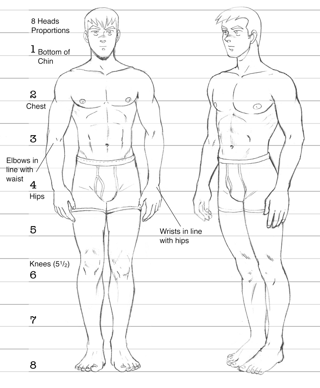
Mike uses classic western “heroic” proportions, measuring 8 heads. They break down as follows:
-
- Head
- Chin to chest
- Chest to navel
- Navel to bottom of the hips (crotch)
- Bottom of hips to mid-thigh
- Mid-thigh to knees
- Knees to mid-shin
- Mid-shin to bottom of the feet.
Also note the proportions of the arm. The elbows are just above waist height and sit roughly in line with the bottom of the rib cage. The wrist fall approximately in line with bottom of the hips. For men, the ribcage and hips are roughly the same width and the shoulders are wider than the hips.
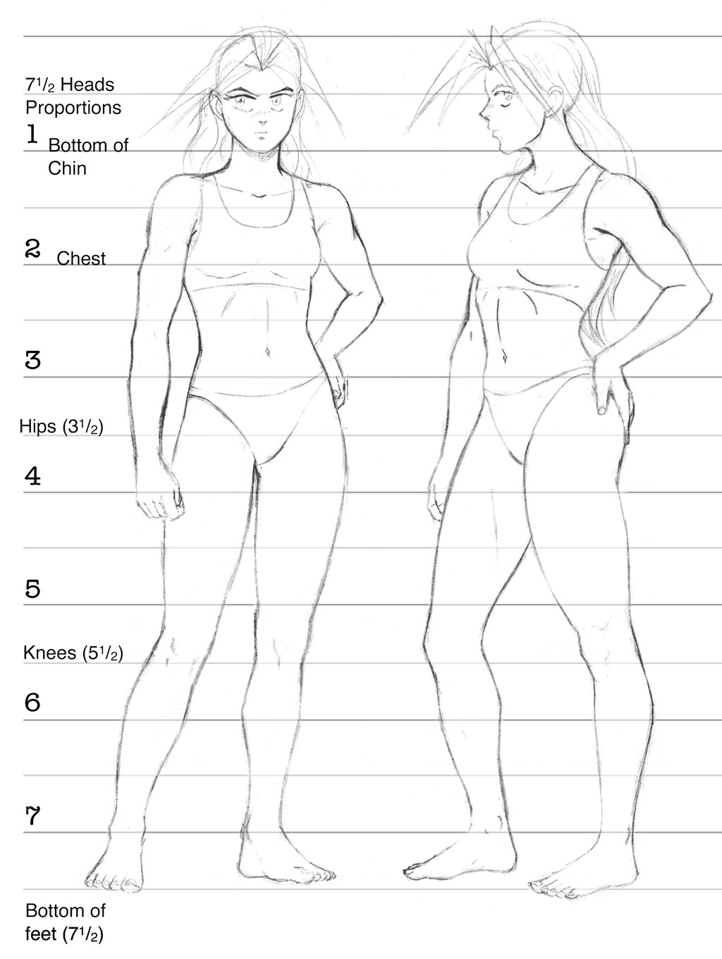
Kate is slightly shorter at 7 1/2 heads, which is closer to “realistic” human proportions. The half head is lost around the hips, making her torso slightly shorter than Mike’s, while her legs are about the same length as his. The “heads” break down as follows with her:
-
- Head
- Chin to chest
- Chest to top of the hips.
- Hips to widest point of the thighs (bottom of the hips are about 3/4 of the way)
- Widest point of the thighs to above the knees
- Above the knee to widest point of the calves
- Widest point of the calves to top of the ankles
- Feet (1/2 head)
Basically, Kate simply has a smaller upper body than her counterpart. Not only is it about a half head shorter, her ribcage is also narrower than her hips and that the midpoint of the shoulders sit roughly in line with the hips as well. Her joints are also narrower and her limbs thinner.
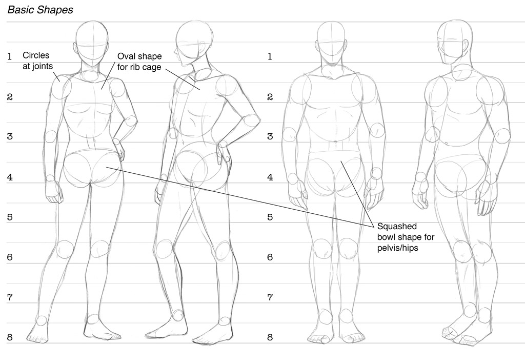
If we strip away the details and look at the underlying shapes, we can see how each figure is constructed more easily. I use circles (which I think of as “balls”) in place of the joints and draw the forms of the limbs between those. I use an egg shape for the ribcage and sort of a flattened “bowl” shape for the pelvis. I have developed simplified forms for each of the major body shapes: upper arms, lower arms, thighs, calves & shins, hand and feet. (More on hands and feet in a moment). I also imagine the shoulder being attached to the collarbone (which it is in reality, as well at the scapula on the back) so it is free to slide around up and down, back and forth on the ribcage when I am posing the figure. Take note of the hip shapes between the two figures.The male’s pelvis is taller while the female’s is shorter and a little wider. This has been a helpful observation for me in my figure drawing.
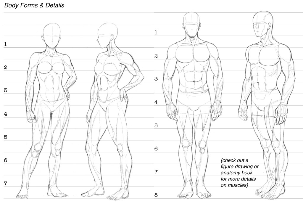
While I won’t go into detail on muscular anatomy (there are entire books on that topic), here is a quick cheat sheet on the basic shapes I’m thinking of when I’m drawing the figure. These shapes are informed by countless hours of drawing characters and human forms from observation and copying drawings out of anatomy books. I highly recommend spending some time on this yourself.
Strike a Pose
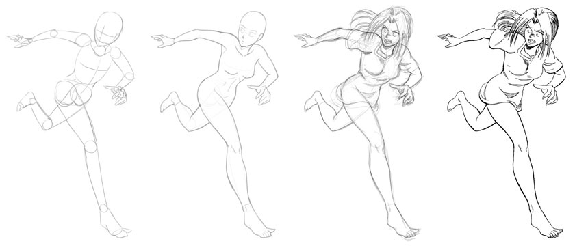
Okay, now that we have the basic shapes and proportions down, we need to be able to draw our characters in more than close-ups and standing around doing nothing. We need to put them into motion so they take on some life. To do that, we need to start with a fluid set of lines, or “gestures”. For the above drawing, I started with a rough drawing like this:
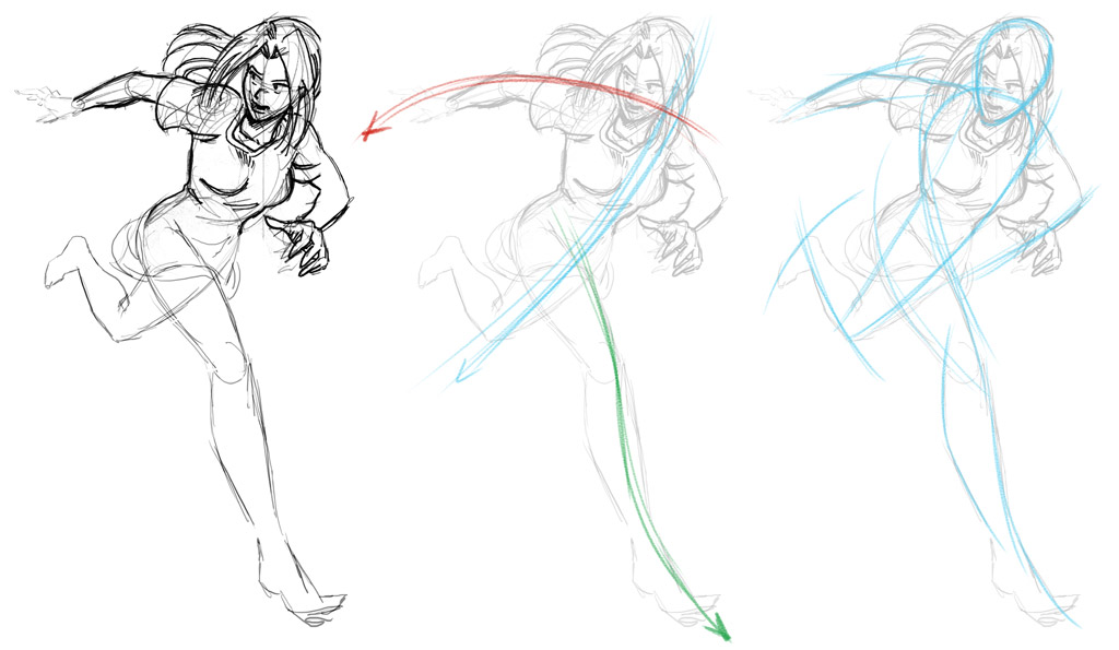 However, in the second image, these were the lines I was using to construct the figure. These are the “gesture” lines—named after 30-second “gestural drawings” which are often done at the beginning of a figure drawing class. The first line in blue goes from Kate’s head down to her knee. The second in red arcs along her arms and shoulders, and the final, in green follows her outstretched leg. Notice how these curves help tie the the forms of the figure together. I use lines like this to build up a pose so it has some underlying life. In the third image, here are some more “flow” lines that pass through the pose. These are the sorts of curves I look for when building up a figure. No straight lines if I can manage it.
Here are the rough forms I’m using to think through this rough figure. I will often draw a quick version like this as a thumbnail, and then draw these forms over the top of that rough to clean up the anatomy.
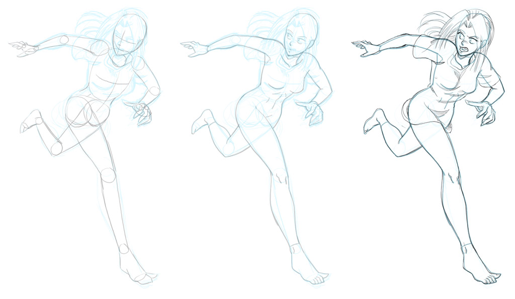
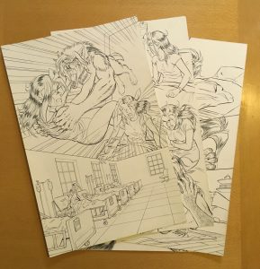
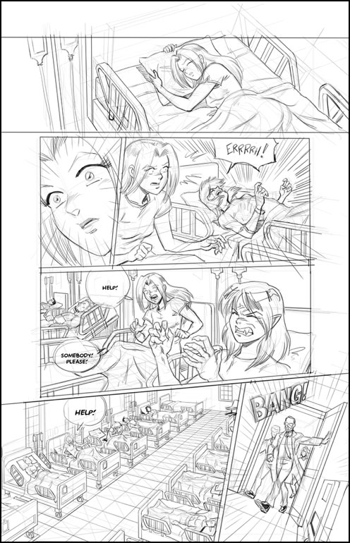
Once the anatomy and proportions are solid, I pencil over the rough and ink the final. I always use this process for creating my finished works. By layering over more and more finished versions, the final benefits from having several chances to correct mistakes along the way.
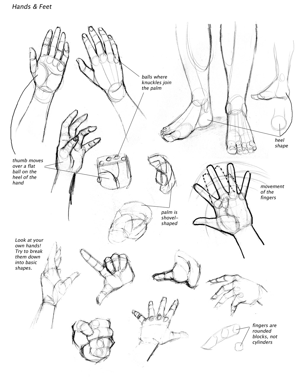
I could do an entire post alone on drawing hands and feet (again, entire books have been written), but the short version is that the way to tackle these complex forms is the same as above: break them down into simpler shapes. I start with sort of a “shovel” shape for the palm, then draw a circle to one side or the other on the wrist end to denote the ball of the thumb. Then I draw a smaller rounded shape on the other side to create the heel of the hand. Each of the four knuckles I draw as circles across the top of the shovel shape, and then a fifth at the end of the ball of the thumb. From there, I draw the fingers an thumb as either a mass (if they are clumped together) or as curved lines roughly indicating each finger. Then I flesh out the individual joints of the each finger as separate shapes, keeping in mind that they are not cylindrical, but more like like rounded blocks.
Drawing great hands takes a lot of practice, and the best way to get good at them is observation. Just like the rest of the figure, practice drawing from life and good reference photos to not only practice the forms of the hand, but also to see how elegant hand poses come together. You will start to see patterns in how the fingers move together as a loose group, not separately (which is why magicians are illustrated using weird hand poses—they don’t look natural). I still practice by using my own hands as reference to help create good hand poses.
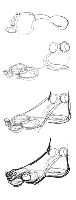 Feet are not as complicated as hands, but they still pose a challenge to people new to drawing the figure. Once again, breaking down the forms into simpler shapes can be helpful.It’s helpful to me to think of a footprint as a starting point—the heel is separated from the ball of the foot and toes by the arch of the foot. We can flesh out those shapes by using balls once again: one larger one for the heel, and two smaller ones for the ball of foot, leaving room for the arch on the inside curve of the foot. Above the heel is the ankle, which has two small bones on each side that connect down to the top of the ball of the foot to create the main wedge of the foot. For the toes, I think of the classic “ninja sock” with the big toe acting independently of the rest of the toes, which generally clump together as a group. When the character is wearing shoes, then all the toes working together as a group. If you’re drawing a bare foot, then keep in mind the smaller toes have a “stair-step” shape to them.
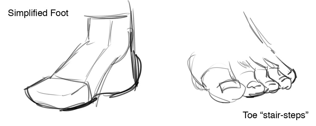
Once you have the basic foot shape down, you can work on putting it in shoes or drawing it bare. It will take some practice to master these shapes, so again, using references and live observation will help you refine your drawings.
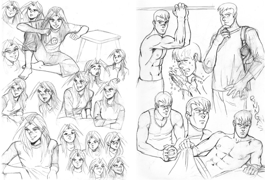
Lastly, I want to emphasize how helpful drawing in a sketchbook can be to help you refine your character drawing. For a couple of years, I drew character studies of Kate & Mike by using photos from magazines as a reference. I borrowed the poses and outfits, but transformed the models into my characters. The drawings below are from those sketchbooks.
I hope this will help you create your own character designs and give some tools to refine them.
Next time, we’ll dive into the story.
If you’re new to the series, welcome! If you’d like prompt updates about the next installment of the series, exclusive cheat sheets, and other behind-the-scenes material with each installment of the series, please sign up for my mailing list:
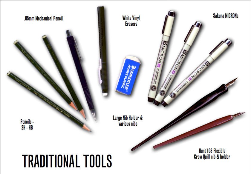
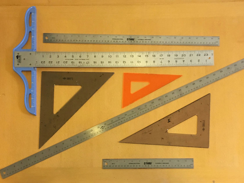
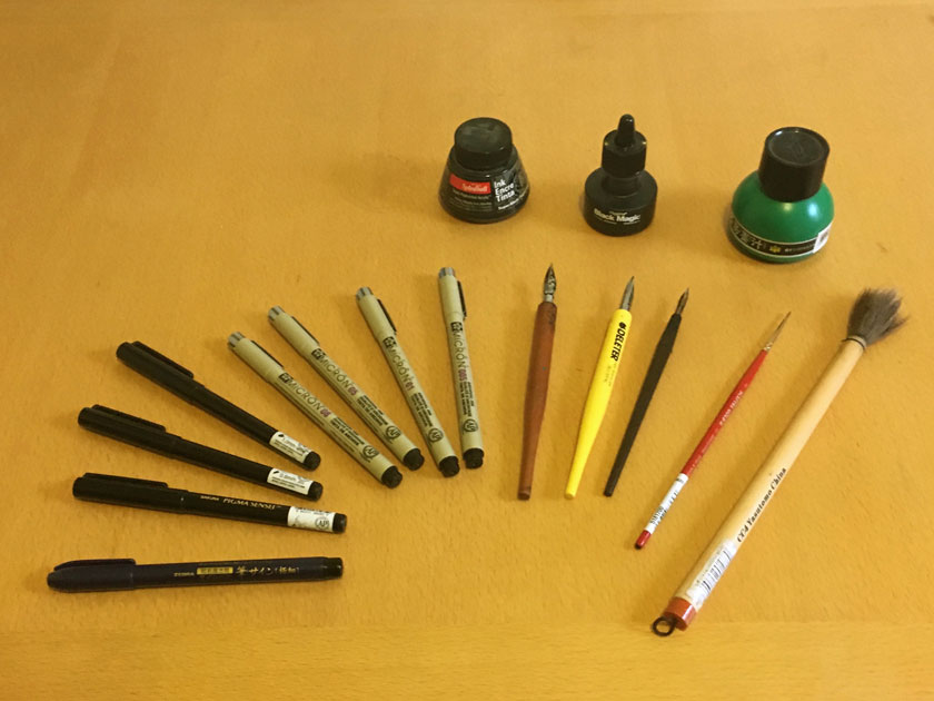
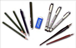
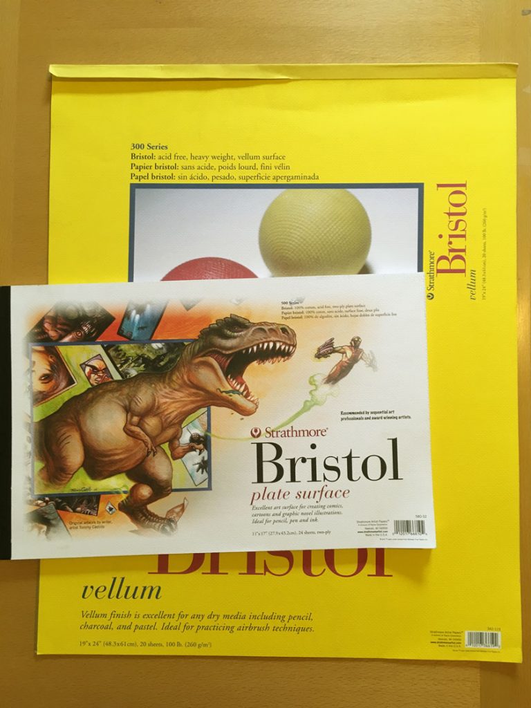 First, a word about paper. Unlike people, not all paper is created equally! It took me awhile to nail down the type of bristol I prefer to draw and ink on. When pencilling, I prefer a Strathmore vellum surface because there’s a little “tooth” to the grain, which reacts nicely with a pencil. However, the disadvantage is that same tooth can grab a pen nib awkwardly if you accidentally push against it (whoops! cue Photoshop touchups here). However, I found that ink also sat nicely on top of it and did not soak into the paper, which can cause the lines to bleed—which I despise! I had that probably when I first started using smooth 300 series bristol. Later, when I started printing up my digital pencils onto bristol, I discovered that Strathmore 500 series plate surface is a dream to ink on. It’s pricier, but worth it.
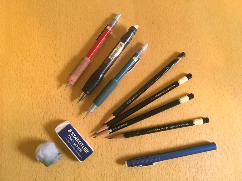

 This weekend I taught
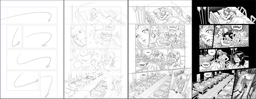
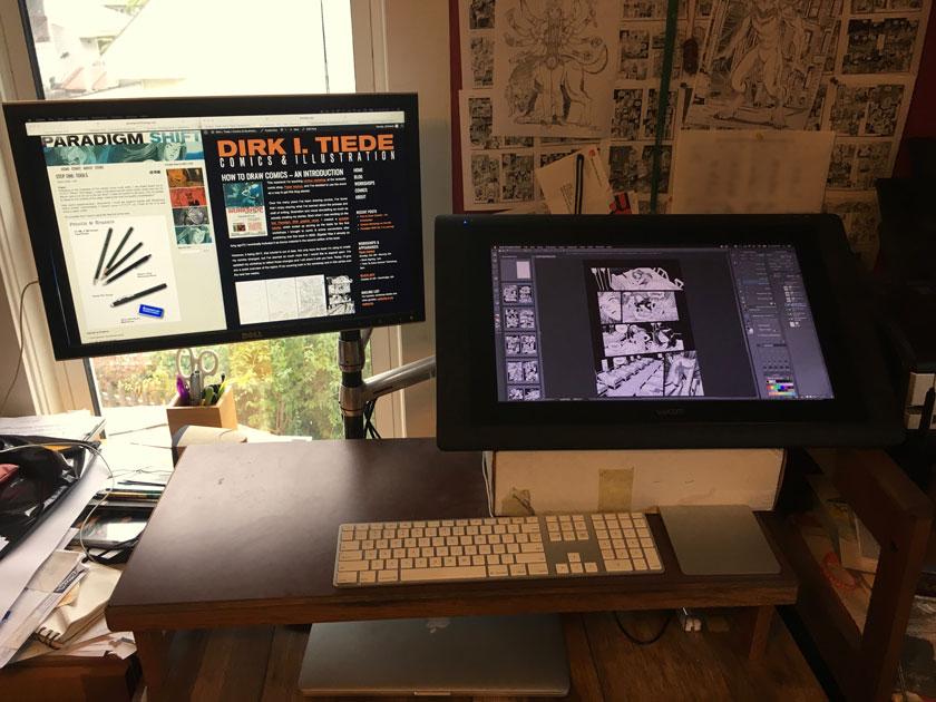
 The biggest change between the tools I used for the first three books of Paradigm Shift and what I’m doing now is I’ve drunk the Kool-Aid and gone all digital. I resisted making this change for many, many years in part because I liked the look of traditional inks, and I enjoyed having a physical page on bristol board when I was finished. However, after developing a repetitive stress issue in my drawing arm, I realize that hunching over while sitting at a drawing desk and making tiny motions with my wrist was not doing me any favors. So, after taking some time off from drawing, I started painting—with real paint and brushes. I also started experimenting with Sumi ink and Japanese horsehair brushes. While retraining my arm (and attitude), I discovered that painting helped satisfy my desire to create an art object. It also taught me that I enjoyed using my whole arm to create brush strokes. So, when I returned to drawing comics, I found it much easier to draw on a screen where I could zoom in, rotate and use my whole arm to create my drawings in way that is easier on my body.
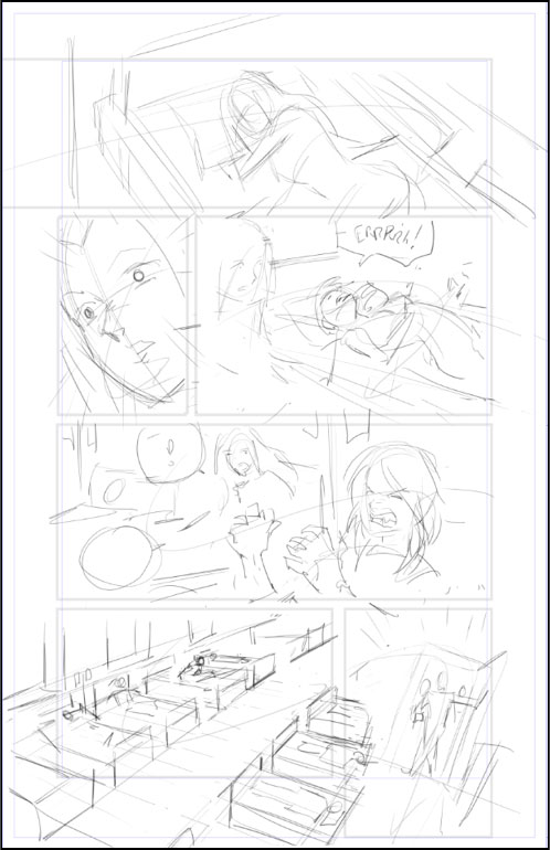
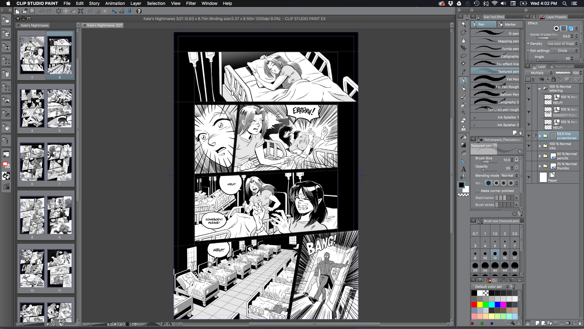
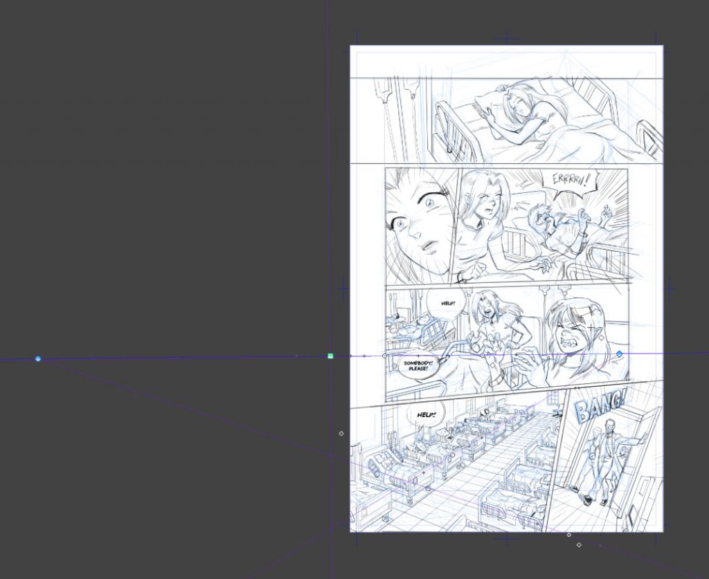
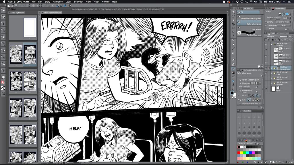
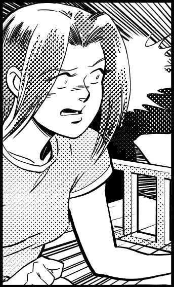 Good screen tone work is all about two things: TEXTURE and VALUE. I love the look of screen tones in black and white comics because it creates a wonderful texture to the art work. It’s also bloody difficult to reproduce well at low resolution, which is why the