Being the second installment of my How to Draw Comics series.
This week, we begin with the tools of the trade. This isn’t a definitive list of “must have” tools, but this is a catalog of the tools I use in the studio. You certainly don’t need anything more than a pencil and piece of paper to make comics, and zeroing in on the tools that work best for you will take time. I hope that taking a look at the materials I’ve come to use over the years will prove useful in narrowing down what you use. For the bare-bones basics, you’ll need:
-
- Paper – bristol board is ideal for comic work
- Pencils – A good HB will do nicely
- Eraser – white vinyl works great
- Straightedge – a ruler, triangle or both!
- Pens – pick your favorite!
Digital tools are optional for comics, but they do offer the flexibility of easy editing and the power to share what you create online. If you’re just getting started, you don’t need a fancy tablet and stylus, though if you already own one, start playing around with it. Here are the essentials:
-
- a computer or tablet
- a scanner or decent camera
- your choice of image editing software
When I began Paradigm Shift, it was 1998, and digital tools were still in the early days. While I had a modded Mac clone (anyone else remember those?), a scanner, and an early Wacom tablet (an ArtZ II!), it was still faster and easier to draw on paper and do touchups on the computer. And that is how I developed my initial process for drawing the comic. I would pencil & ink the pages on 11”x17” bristol board, then scan them into Photoshop for touchup, screentones and lettering.
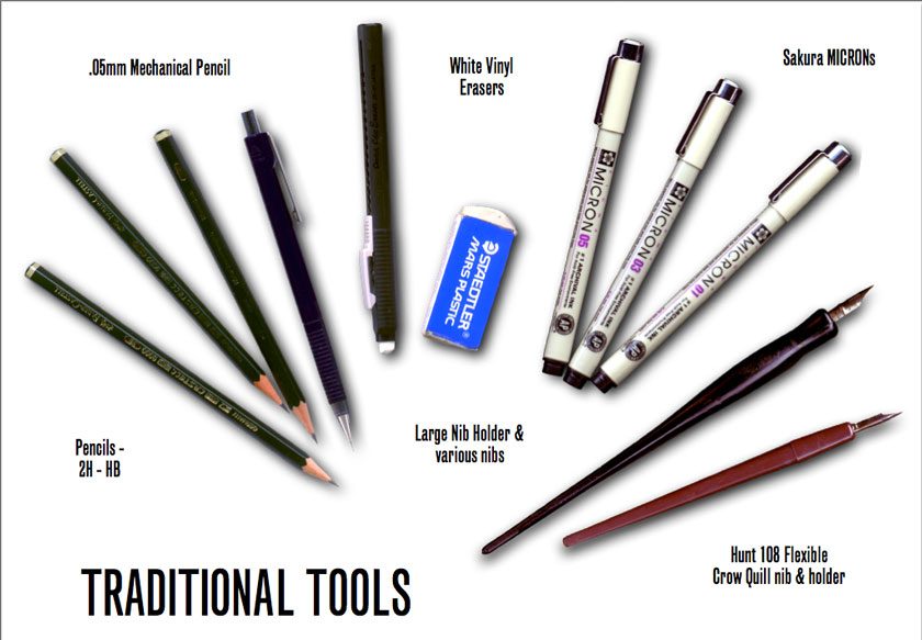
Traditional Tools:
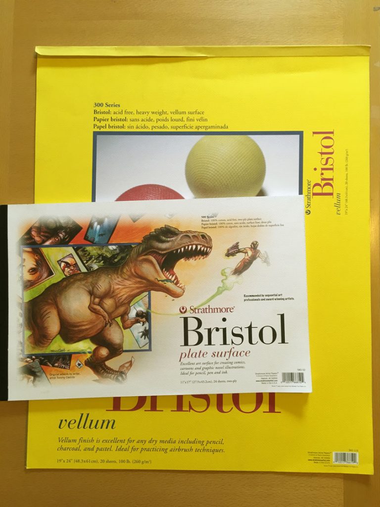 First, a word about paper. Unlike people, not all paper is created equally! It took me awhile to nail down the type of bristol I prefer to draw and ink on. When pencilling, I prefer a Strathmore vellum surface because there’s a little “tooth” to the grain, which reacts nicely with a pencil. However, the disadvantage is that same tooth can grab a pen nib awkwardly if you accidentally push against it (whoops! cue Photoshop touchups here). However, I found that ink also sat nicely on top of it and did not soak into the paper, which can cause the lines to bleed—which I despise! I had that probably when I first started using smooth 300 series bristol. Later, when I started printing up my digital pencils onto bristol, I discovered that Strathmore 500 series plate surface is a dream to ink on. It’s pricier, but worth it.
-
- Strathmore Bristol, 300 series vellum surface for pencilling and brush work
- Strathmore 500 series plate surface for dip pen work over digitally printed pencils
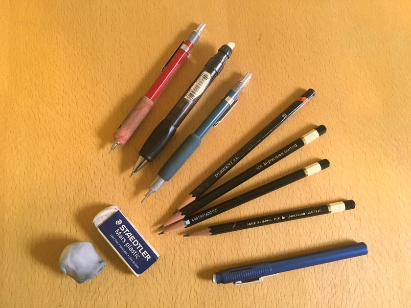
Pencils come and pencils go. I used to favor a combination of H, HB & 2B lead. I would use H for roughs and HB or softer for final pencils, but these days I just stick with HB. I use wooden pencils (Tombows are my favorite) for roughs, and then use mechanical pencils in three sizes for backgrounds the require rulers and other tighter detail work. For erasers, I vastly prefer a certain soft, white, smooth-texture that Pentel Clic and Staedtler Mars eraser provide. They erase cleanly and effectly. Recently, I’ve also re-discovered the classic kneaded eraser, which also erases very well, and can be sculpted to smaller shapes for more accurate eradication.
-
- HB wooden pencils (I use Tombows these days)
- .03mm, .05mm & .07mm mechanical pencils w/ HB lead
- Pentel Clic erasers (good, soft white vinyl erases very effectively)
- Staedtler Mars Plastic block eraser (same white vinyl as the Pentel Clic)
- Kneaded eraser
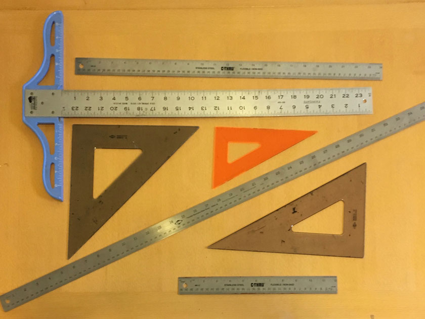
Straight-edges are a must for comics. For drawing guides and panel borders, a T-square and triangles are your best bet. For perspective, having a long ruler is really handy, especially if your vanishing points go off the edge of the page. Also, you’ll need a raised edge for inking, otherwise the ink can bleed off in between the ruler and the paper.
-
- 24” T-square
- 45º & 30/60º triangles
- Raised, cork-backed inking rulers: 12”, 24” (even 36” sometimes!)
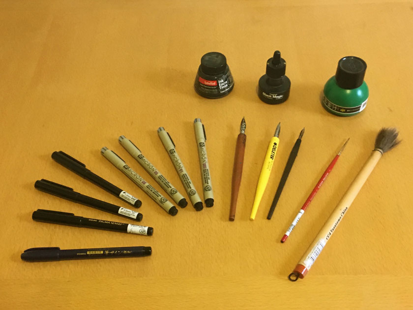
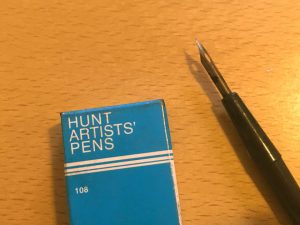
There are a variety of tools in the arsenal for inking. I use dip pens and occasionally brushes for characters and natural, organic backgrounds because you can vary the line weight dramatically. My favorite dip pen is the Hunt 109 Flexible nib. It is essentially a Crow Quill, only made out of copper instead of steel, so it has more “give”. This means it’s easier to vary the line weight. The downside of them is they bend out of shape easily, so I buy them in boxes of a dozen at a time–at least they’re cheap! Over the past few years brush pens have been improving, and so I keep them around for quick drawings in my sketchbook. I save the technical pens for objects and architecture, because the lines are stiffer and less variable, so they look more solid and “dead”.
-
- Sakura MICRON pens, size 005, 01, 05, & 08 for finer lines for backgrounds & technical art
- Sakura Pigma SENSEI pens, size 06 & 10 for black fills
- Hunt 108 Flexible nibs (by the dozen) for characters
- Windsor & Newton Round 01 watercolor brushes for fine organic line work
- Round Japanese Horsehair bamboo Sumi brushes for big, fat organic strokes
Also, the type of ink matters. When I first started to use a dip pen, all my local art store carried was Higgins Black Magic and Speedball India. The former was too thin and the latter too thick for my favored Hunt 108 nibs, so I would either mix the two, or let the Higgins sit out overnight with the cap off, so it evaporated a little to thicken up—either way it was a home brew mix. I know other artists who swear by other brands, but I found that worked for me. For larger works (such as portraits), I turn to Sumi ink to use with my big bamboo and horsehair brush.
-
- Waterproof Black India for comics
- Sumi Ink for larger works
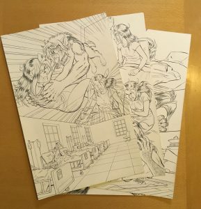
My original process involved thumb nailing my comic pages in a sketchbook, then manually drawing in the 1” margins and 1/2” bleed on 11”x17” bristol before diving into the pencils. I would scan my pencil work before proceeding on with the inks. I ink in the following sequence (which I continue use): borders, balloons, sound effects, characters and finally backgrounds. Once the inks were complete, a quick scan and stitch in Photoshop, then touchup, lettering and tone work.
The upside of using all these traditional tools was, first and foremost, I really got to know how to plan and use the medium very well. Drawing in pencil means you need to think about where to place objects on the page. You can erase, but it takes time to redraw things.
And there is no substitute for training to ink with real nibs, brushes and india ink. Digital is awesome, but there’s always that “Undo” button. When it’s just you, your loaded brush and a piece of paper, you have to focus and put down that ink stroke with purpose because there are no redos. And finally, you also get a beautiful and unique piece of physical artwork at the end.
Going Digital
I worked with this hybrid of traditional and digital for three graphic novels, but then in 2010 I purchased my first Wacom Cintiq, which allowed me to draw directly on the screen for the first time. At that point I switched over to doing my pencils digitally. I started out by pencilling in Photoshop, then printing out the pencils onto Bristol to ink with a nib. However, I did not like how Photoshop brushes worked, so I continued to ink on paper by printing up the pencil work in light blue onto bristol and then inking as I would normallly (I’ll cover this more in detail in the inking tutorial later). The process was marginally faster than before, since I could make edits directly to the pencils before I inked, but there was still a learning curve involved.
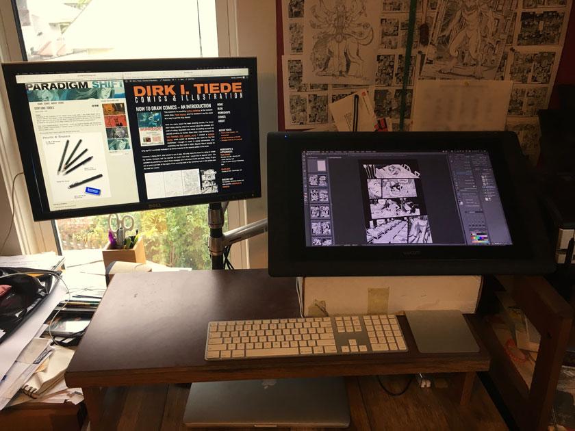
However, after taking some time off from drawing comics, when I returned to the fold with STRANGER, I experimented with doing the whole comic digitally in Manga Studio. I was happy with the results, and when I returned to working on PS Vol. 4, I decided to stay digital because I found I was working much more quickly than before. The main reason for this is I can go from thumbnails to finished page by working in layers in the same file. No scanning, no bouncing around between programs. I can even gang entire scenes (or even issues) together in a master file, so it’s easy to think of the pages as a sequence.
My weapon of choice is now CLIP Studio Paint (formerly Manga Studio 5). Here’s how I set up my workspace.
When I decided to return to PS Vol.4, I knew I wanted to finish it out digitally. However, I knew the first trick would be to try to match the look of the pages I had inked on bristol.
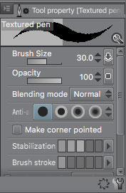
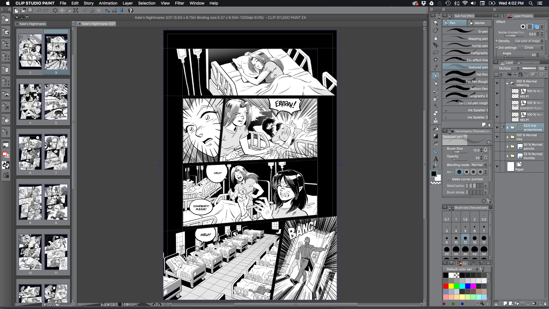
The first step was to set the ink pen settings so my matched the lines I was producing with my Hunt 108. Unlike the default G-pen, which creates super slick smooth lines, my ink lines had a small amount of shake to them. So I modified it to have a textured brush shape and found that setting the size to 30 produced lines that were similar in size and character to the lines I was used to with the Hunt. I will also take it down to size 20 for finer line work, but I basically only bounce between those sizes (or occasionally bigger). Anything smaller than that will get lost in the final printout.
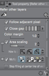
Another tool I love in CLIP is how the Paint Bucket is implemented. It can close gaps and expand fills automatically. This makes toning and coloring incredibly fast. I used to have a method worked up in Photoshop that required 2 or 3 key commands and some trial and error to fill areas, but no longer need it here.
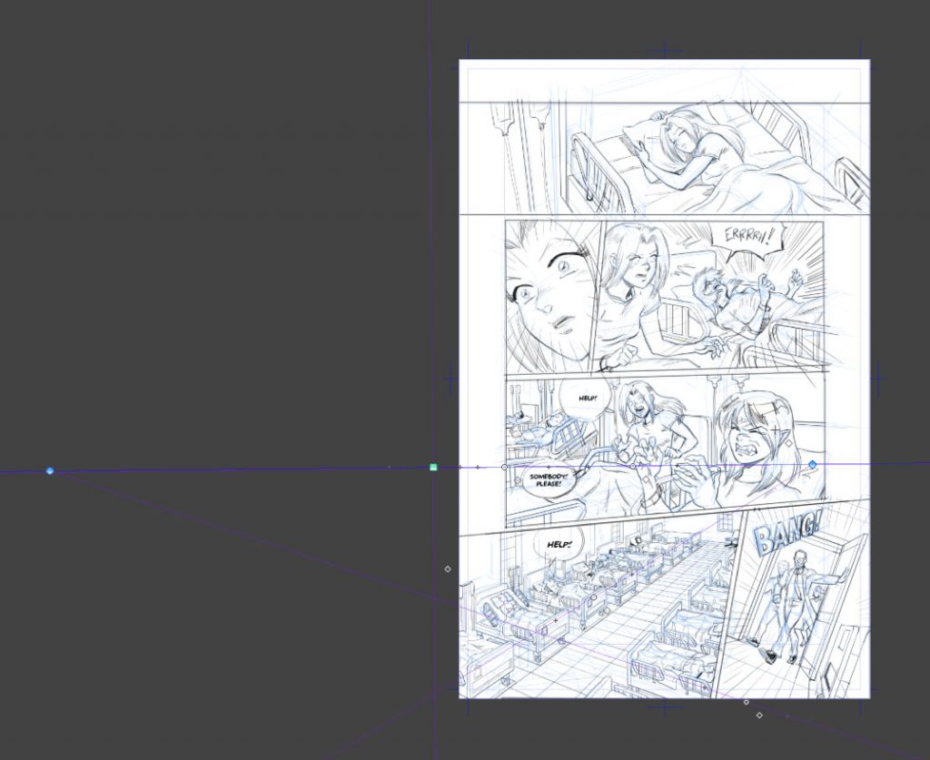
However, the thing that sold me completely on CLIP was its ruler tools, especially the Perspective Ruler. I love using perspective. Anyone who has read the first few books of Paradigm Shift will know of all the cityscapes I drew—all of which were done by hand, with pencil and ruler, and then again in ink. It can be a time-consuming, but very rewarding process. There’s a dual-page spread in Book 3 that took me two weeks. The vanishing points were on pieces of paper that I extended off the edge of the page.
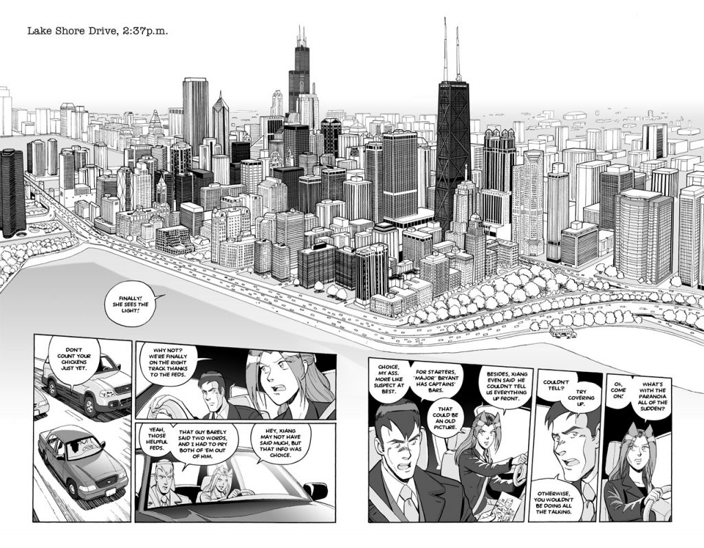
Setting up shots like this are a lot easier in CLIP. Once I determine my horizon and vanishing points (up to 3!), my lines will automatically snap to each of the three axes. On paper, I’d have to place the rule by hand to line up with the vanishing point. This saves me so much time! And it’s really, really fun. I do have to hold myself back a bit, though. Not every panel needs 3-point perspective, but…
The rest of CLIP’s ruler tools are great, too. There’s a Focus ruler tool, which is perfect for those manga-esque burst effects and speed lines. But there’s also curves, concentric circles, and a symmetrical ruler for trippy, kaleidoscopic effects.
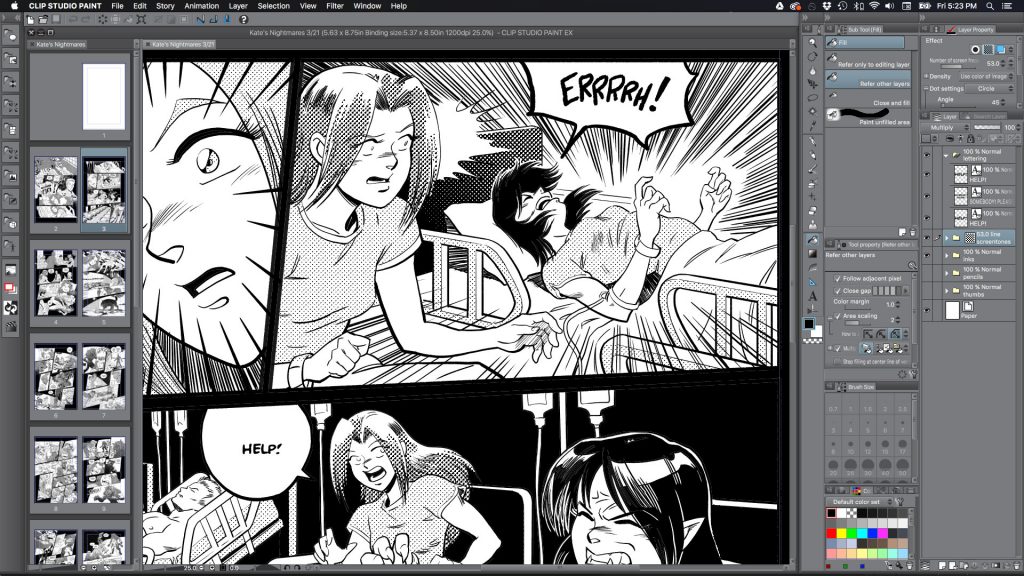
Lastly, I love that I can I live preview screen tones. I can lay down grayscale on a layer, and then hit a button and see how a panel will look with the dots applied. Very helpful! I found my tone work became more simplified once I could see it while I was toning the page. The textured pattern will overpower detailed lifework pretty fast, so I became more aware about how much a page did or didn’t need right away. I could pull off the same effect in Photoshop, but I had to copy/paste a flattened version of the page to a new document, then render out halftone using Image>Mode>Bitmap. It was just enough of a hassle that I didn’t do it all that often.
If this sounds like an infomercial for CLIP, I don’t mean it to be. I still use Photoshop for all my image-editing needs, but CLIP is a far superior illustration tool. The main downside is its text engine. It’s just not robust enough for lettering. My workaround is to put in placeholder dialogue in CLIP and then replace it in the final PSD file in Photoshop once the drawing is complete. That way I can use Photoshop’s kerning and vector-based text objects for the final dialogue. It’s really the only hiccup in the process at the moment.
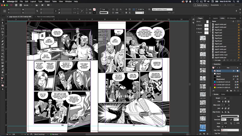
Lastly, I use Adobe InDesign for my page layout and print production needs. I lean on Adobe Illustrator from time to time to create logos, patterns, and other shape-based stuff. I also use SketchUp to construct virtual “sets” for certain scenes—which is perfect for science fiction stories! More on all that in a future installment.
Here’s a rundown of my current digital tools:
-
- Late 2013 Retina 15-in MacBook Pro (16GB RAM, 512GB HD, 2.3 GHz Intel Core i7)
- Wacom Cintiq 22HD
- iPad Pro 12.9” w/ Apple Pencil and AstroPad (which turns it into a Cintiq clone for mobile use)
- Epson Photo 1400 large-format printer
- Adobe Creative Suite – Photoshop, Illustrator, InDesign
- CLIP Studio Paint
- Trimble SketchUp Make
The upside to all these wonderful digital tools is that they are fast, flexible and allow me zoom in on my work and use my whole arm to draw, which is good for me ergonomically. They are incredibly powerful and pretty much allow me to get even closer to my intended visual ideas than I ever could before.
The downside of these tools is obvious—they’re expensive! Keeping up with the pace of technology is difficult. And Cintiqs are a serious investment. However, you don’t need a big, expensive tablet to use these tools these days. There are all sorts of options for those on a budget. Adobe’s Creative Suite is also a cool $50 a month, which is a chunk of change if you’re just getting started. CLIP Studio is affordable, though, and the pro version can be found on sale for $100 or less from time to time.
The other major problem is there will never be a physical art object of the digital work I’ve done, only printed facsimiles. The art itself only exists as 0’s and 1’s on my hard drive. Also, I have found that working exclusively digitally does dull my skills with my traditional tools over time, so it’s good for me to take a break and do a real painting, portrait or ink drawing now and then to keep my practice up. Lastly, all this digital flexibility can lead to some indecision. If I can change something infinitely, it introduces the subtle temptation for perfection, which will inevitably disappoint. Though, I fell into that trap before I went all digital, too. However, I’ve found that working in batches and thumbnailing and pencilling ahead has reduced my attachment to any single page, and made this tendency lessen over time.
In the final analysis, there’s no “right” tool to draw your comics. Traditional was a great way for me for 15 years. Now digital is my preference. I may switch back one day. Play around and find what works best for you.
Next week we’ll dive into creating characters and working with our influences.
If you’re new to the series, welcome! If you’d like prompt updates about the next installment of the series, exclusive cheat sheets, and other behind-the-scenes material with each installment of the series, please sign up for my mailing list: